Design
May 6, 2022

Because Elden Ring is an open world game, there is a great deal of effort put into making sure that players can progress through it at a comfortable pace. This is achieved in a very creative way: instead of presenting players with enemies of linearly increasing difficulty, the game instead puts beginning areas right next to mid or late-game ones. In doing this, players are taught from very early on that it’s okay to skip a boss or area and come back once they are properly leveled for it.

The first example of this that players encounter is with an optional boss—Tree Sentinel—situated right in front of the first checkpoint. Tree Sentinel is a gigantic, heavily-armored knight on horseback that deals a significant amount of damage while also moving quite quickly. The boss is out in the open, meaning that players can run away from it at any time to go do something else—a course of action that many will take after realizing just how powerful Tree Sentinel is. I didn’t even bother fighting it until I was around ten hours into the game, at which point the fight was still a pretty even match between me and the boss.
One other key design feature in Elden Ring’s world is its retention of the level design featured in past Soulslike games in certain areas. In previous FromSoftware titles, players could only roam around on foot. Most areas were tight, with enemies around every corner and sparse, difficult-to-reach checkpoints. Although this style of level design couldn’t possibly be fully implemented in an open world game, Elden Ring uses it in select areas. When entering catacombs and most castles, players are forced to dismount their horse and cannot remount it until they exit the area once more. The horse’s removal is important, as it preserves both the Soulslike feel of Elden Ring as well as the integrity of its gameplay. Less mobility leaves less room for players to exploit the physics of the game engine and potentially make certain areas much easier to complete.

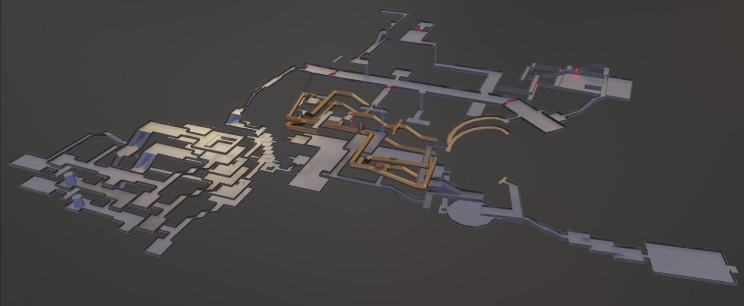
Speaking of catacombs, there are at least 16 formal catacomb areas in Elden Ring. It’s important to note that none of these are major areas—they are all optional and off the beaten path. That being said, the catacomb areas in this game contain some of the most creative level design I have ever encountered in a video game. The basic design of each catacomb is simple: A single checkpoint lies immediately within the entrance. Near this entrance, there is a closed mechanical door that can be unlocked via a lever at an unknown location somewhere within the catacomb system. Players must find their way to the lever, pull it, and double back to the entrance in order to pass through the newly opened door to fight an optional boss.
Although this is the gist of all of the catacomb areas in the game, they become increasingly complicated as the game progresses. One of my favorite experiences in Elden Ring was working my way through the Leyndell Catacombs, a vast network of complicated tunnels that concludes with an intentionally confusing test of a player’s awareness. In the final part of the catacomb, there is a set of three identical-looking floors stacked on top of each other in such a way that it seems like you’re wandering around in three massive circles. The only signal to players that the floors are different is that each floor has a different set of items and enemies. I spent about an hour in this catacomb system and was blown away by the fact that the last section of repeating floors was built without any abuse of video game rendering: the way the three floors were laid out made sense, and didn’t necessitate any cheeky off-screen rendering to pull off.
Elden Ring is full of extraordinary level design. It’s clear that FromSoftware had hundreds of different ideas that it executed all at once by compartmentalizing them in each of their respective areas. What’s even more impressive is that all of this is built seamlessly—despite all of these different ideas, Elden Ring feels like a coherent game from start to finish. There is no area that feels out of place.
